UNTLD
Media Co.
A media company built for the culture. Identity, digital, and creative direction for a team whose clients include Mercedes, Netflix, and L'Oréal.
A media company that doesn't need to explain itself.
UNTLD came in knowing what they were. A creative and production studio working with some of the biggest names in the world — Mercedes, Netflix, Lamborghini, L'Oréal. The brand just hadn't caught up with the work yet.
The brief was to build something that matched the level of their clients without saying too much. A media company identity that felt expensive, considered, and impossible to date — because work this good doesn't age.
Every decision, from the logo system to the site architecture, was made with that standard in mind. If it wouldn't sit comfortably next to a Mercedes campaign, it wasn't right.
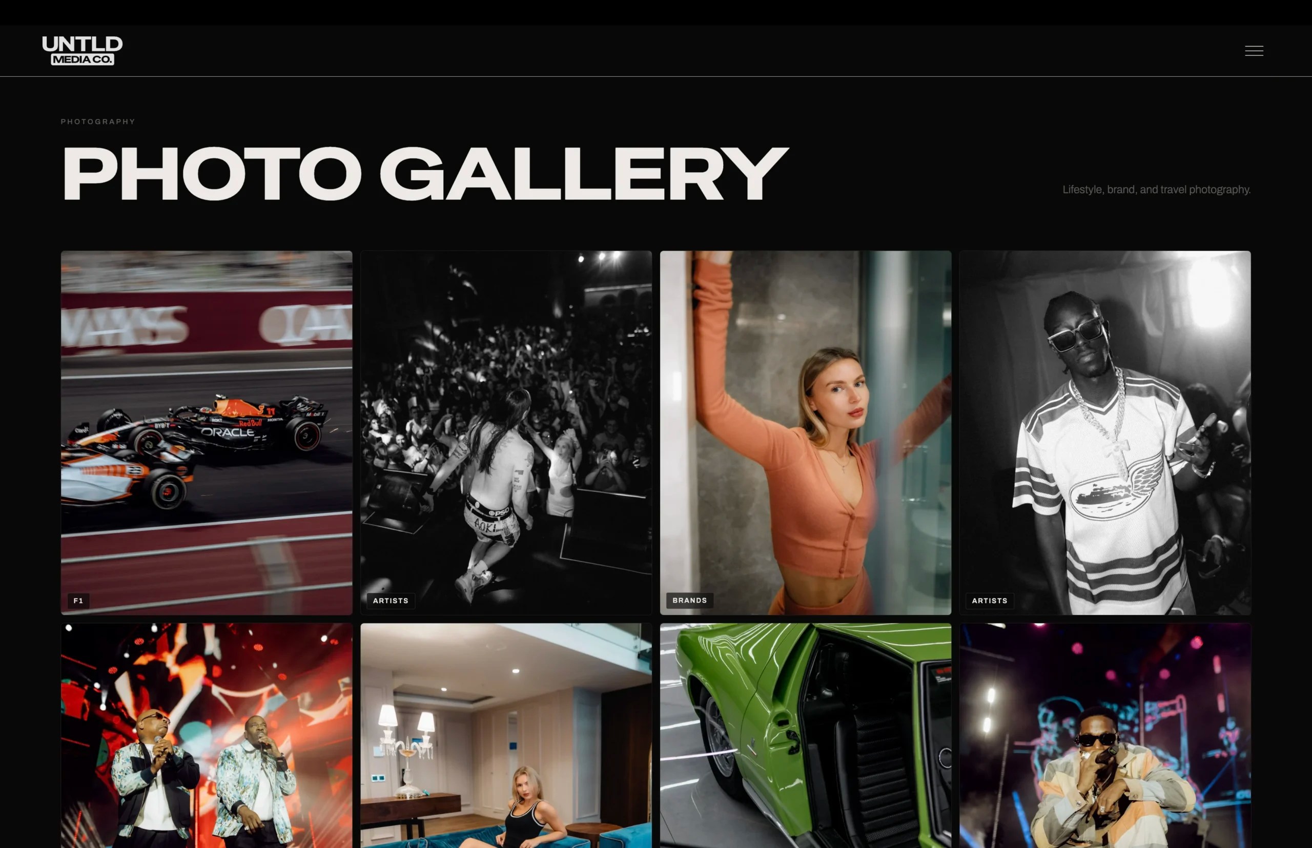
Brand Identity
Full logo system — SD card logomark, stacked and horizontal wordmarks — built to work across every format and application.
Website
A full site build — designed and developed to position UNTLD at the level of their clients. Fast, cinematic, and built to convert.
Creative Direction
Visual language guidelines, colour system, and type hierarchy — ensuring everything UNTLD produces feels like it came from the same hand.
Digital Presence
Social profiles, email signatures, and digital asset templates — a complete toolkit for showing up at the right level every time.
A logo system,
not just a logo.
Three marks, one language. The SD card logomark, the stacked wordmark, and the horizontal wordmark — each built for a specific context, all unmistakably UNTLD.


Built for every format.
The SD card mark works when there's no room for a name. The stacked and long wordmarks work when there is. Together they cover every application — from a 16×16px favicon to a full-width site header.
Each mark floats independently. Hover to isolate one — the others step back.
Rahman.